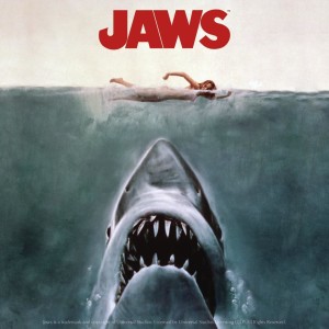
 A wise person once said:
“If they put as much attention to detail into making a movie as they into marketing a movie, we wouldn’t see so much crap coming out of Hollywood.”
This statement is very true, especially when one considers the immense effort that goes into marketing a movie.
The movie poster, the movie trailer, various premiers along with guest spots on talk shows, all come together to serve one purpose…to get you in the seat at the theater when the movie is released.
It just so happens that there is some complex psychology used to persuade you to see a movie.
This is especially true when creating a movie poster.
Their goal is for the movie poster to become synonymous with the movie and instantly recognizable.
There are a few common elements featured on every well-designed movie poster, which you can use to boost your business's brand and image.
How Can The Methods Used by Marketing Professionals in the Movie Industry Be Used in the Business Arena?
You may wonder what this means to you as a business owner. It’s interesting, but how can you benefit?
The answer is that the same methods used to promote movies can be utilized to boost a business.
To make this process easier, read below for a few of the psychological marketing elements that are commonly implemented in designing movie posters that you too can use for your business's advertising:
THE USE OF COLOR
Color is a crucial aspect of a well-designed movie poster. This should also be true in regards to your marketing efforts. Study colors and what they mean to determine what colors best communicates what you are trying to say as a business owner. There are a few general truths when it comes to color and what they represent. To help you decide what colors best communicate your business’s message, read the handy guide listed below:
Blue: This color is cool and communicates trustworthiness.
Yellow: This is a power color, but can be overused. Don’t go overboard.
Green: Is a versatile color. It’s both warm and inviting. It also communicates environmental goodwill and health.
Purple: The color of royalty, communicates elegance and prestige.
Gold: Also, an elegant and prestigious color. However, it also denotes power.
Orange: Calls to mind energy. It’s cool and fun.
Brown: This is an earthy tone, communicates relaxation.
Black: It is a versatile color. It can used to contrast with other colors and tends to add drama and alter mood.
Red: This color is powerful and attention getting. Ergo, it’s a very common marketing color.
APPEARANCE AND IMAGE
Another important element used by movie marketing professionals is the all-important image. You should also spend extra time molding the image you want to associate with your business or brand.
If you are unsure how to create said image, hire a professional, or a graphic design student who is looking for a project to practice on, to design your business’s image.
Remember, you want to include the colors that best communicates your message as a business and also include an eye-catching image.
Once you have your “image”, plaster it everywhere. Put it on your website, Facebook page, business cards, and letterhead and everywhere else it’s applicable. It is worth noting that you should make sure your image is easy to understand for the general public.
In other words, don’t use an image that is too abstract or one that only professionals in your field would understand. Make sure everyone can understand the message you are conveying.
LEAVE THEM WANTING MORE BY CREATING INTRIGUE
When designing a marketing campaign, it is a great idea to create some intrigue. Marketing professionals in the movie industry do this all the time, especially in regards to movie posters and movie trailers. They don’t want to give everything away.
You too can use their method. No, you don’t want to be ambiguous to the point of confusion. However, getting your customers talking about you is a good way to get your brand out there.
A good example of this in practice is the latest marketing campaign by Buick staring actor Matthew McConaughey.
The whole premise of the ad is intriguing. As a result, it causes viewers to attempt to figure out what it all means. Buick has noted an increase in sales since the release of the ad of a full 25 % in just a month’s time. Therefore, as you can see, creating some intrigue in an ad is a great marketing tactic.
Keep in mind, there is a fine line between intriguing and just odd and confusing, so be careful to stay on the side of intriguing when creating your advertising campaign.
Now you have heard all about how Hollywood marketing professionals use psychology to design movie posters.
You have also learned how you too as a business owner can use some of the same methods to further your business and create a certain reputation for your company.
Now all you need to do is define your goals for you business along with create the image you want to portray to potential customers.
Then, email, Facebook, advertise on the radio and TV and encourage word-of-mouth advertising– by rewarding your current customers– and you are likely to note an increase in revenue.

